The data work on the IEO is not hard arithmetic, it is disciplined reading. Across the three parts we can verify — a 40-question finance and economics multiple-choice paper, five open questions of which four are scored, and a team business case in English — the recurring failure is rarely a miscalculation. It is a misread: a nominal figure treated as real, an index number read as a level, two series compared across different base years.
Why this is a different skill from the calculation itself
We have written separately about the calculation families you need — elasticities, growth rates, compounding, marginal reasoning. This is the other half, and students consistently underrate it because it does not feel like a skill. Arithmetic is visibly hard, so it gets practised. Reading a table feels like something you can already do, so it does not.
The diagnostic is simple. Take any data question you got wrong and ask which step broke. If you set up the right expression and then slipped a decimal, that is a calculation problem and drilling fixes it. If you produced a flawless calculation on the wrong quantity — you deflated by the wrong index, or you compared a stock with a flow, or you read 3.2 as a percentage when it was a percentage point — then no amount of arithmetic practice will help. That is an interpretation problem, and it has its own drills.
In the work we mark, the second category dominates among students arriving from strong quantitative tracks. They are fast and accurate, and they lose marks anyway, because speed applied to a misread quantity only gets you to the wrong answer sooner. The rest of this piece is the interpretation half.
Real terms: the distinction that shows up more than any other
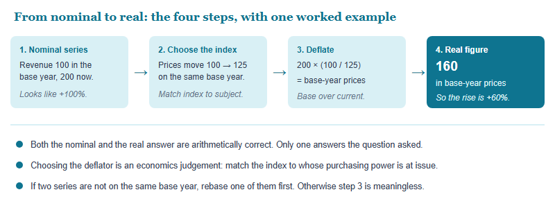
If you fix one thing, fix this. Any figure measured in money and compared across time has to be put into consistent prices before the comparison means anything. A wage that rose from 100 to 200 has not doubled in any sense a student should care about if prices rose 25% over the same period.
The conversion is one line, and it is worth being able to write without thinking: a real figure equals the nominal figure multiplied by the base-period index divided by the current-period index. What trips people is not the formula but the choice of deflator. Deflating a household's spending power calls for a consumer price index; deflating national output calls for a broader deflator; deflating one firm's revenue may call for an industry-specific measure. Using a general consumer index on a question about a producer's margins is a substantive error, not a rounding one.
Index numbers and base years
An index number is a ratio wearing a disguise. When a series reads 118, that is not a quantity, a price, or a level of anything. It says: relative to whatever period was set to 100, this is 18% higher. Everything that goes wrong with index numbers goes wrong because a student forgot the second half of that sentence.
Three consequences follow, and each is examinable in a single line of a table:
- Two indices with different base years cannot be compared directly. One series based on 2015 and another based on 2020 will produce a difference that is partly an artefact of the base choice. Rebase, then compare.
- A rise in an index is not the same as a rise in the thing. An index of prices rising more slowly still means prices are rising. A falling inflation rate is not falling prices. This distinction — the level, the rate of change, and the change in the rate of change — sits behind a large share of macro data questions.
- Percentage and percentage point are different units. A rate moving from 4% to 5% has risen by one percentage point and by 25%. Both statements are true, they are not interchangeable, and a question will often be built so that only one of them appears on the answer list.
The habit worth building is a one-second annotation. Whenever a table appears, write in the margin what each column actually is: level or rate, nominal or real, stock or flow, and which base year. Four labels, ten seconds, and most of the traps below stop working on you.
Six traps, and the tell for each one
These are the misreads that come up most often in the student work we mark. The middle column is what the trap looks like from the inside — the reason the wrong answer feels right at the time.
| The trap | Why the wrong answer feels correct | The tell that catches it |
|---|---|---|
| Nominal read as real | The number genuinely did rise, and the growth you compute is genuinely there | The question spans more than a year, or hands you a price index you have not used |
| Stock confused with flow | Both are measured in money and sit in the same table | Ask “per what?” Debt is a stock, a deficit is a flow. A stock has a date; a flow has a period |
| Percentage vs percentage point | Both readings are arithmetically defensible | The options contain both numbers. That is the signal the distinction is the point of the question |
| Different base years | The two columns look like they belong together because they sit side by side | Check the column header for the base period before subtracting anything |
| Level vs rate of change | “Inflation fell” sounds like “prices fell” | Name the axis out loud. If the series is a rate, a decline still means the level is climbing |
| Averages hiding distribution | A mean is a true fact about the data | Any question about who gains or loses is a distribution question, and a mean cannot answer it |
The last row deserves a note because it crosses from the multiple-choice paper into written work. Where an open question turns on the effect of a policy on a population, an answer built on an average will be structurally incomplete however well it is argued; the range of topics actually set is published by the organisers, so check the current syllabus on ieo-official.org. If the question asks who bears a cost, the answer needs a distribution, or at minimum an explicit acknowledgement that the average conceals one.
Where data work bites in each of the three parts
The same four operations — label the quantity, put money into consistent prices, separate level from rate, and check the comparison is legitimate — run through all three parts. What changes is the tempo, and what a mistake costs you.
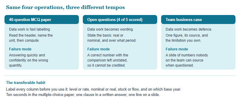
In our own marking of student work, the written parts tend to be more forgiving of a shaky number and less forgiving of an unstated basis: in the multiple-choice paper you either have the right quantity or you do not, whereas an answer that names its terms is at least possible to follow while an unlabelled figure is not. The marking scheme is the organisers’ own, so confirm current marking arrangements on ieo-official.org. That asymmetry is worth internalising before you decide where revision time goes.
A four-week drill that fits alongside a season plan
This is deliberately small. Data interpretation improves with frequency rather than volume, and it competes for time with everything else, so treat it as twenty minutes rather than an evening. It sits underneath the content work in our 12-week preparation plan rather than replacing any part of it.
- Week 1 — labelling only. Take any statistical table from a public source and write the four labels on every column. Do not calculate anything. The aim is to make labelling automatic so that it survives time pressure.
- Week 2 — deflate everything. Every money figure you meet, convert to a consistent price basis and say which index you chose and why. The justification is the exercise; the arithmetic is trivial.
- Week 3 — level, rate, and change in the rate. Take one series and describe it three ways. Then write the sentence a careless reader would write about it, and explain why it is wrong. This is the drill that fixes the inflation misreading permanently.
- Week 4 — the hostile question. For each figure you produce, write the single hardest challenge to it and a one-sentence answer. This is direct preparation for defending numbers under questioning in the team business case round, where a figure you cannot source is worse than no figure at all.
One caution on practice material. Use published statistical releases and reputable data portals rather than second-hand summaries, because the whole skill lives in the headers and footnotes that summaries strip out. And if you are still working out how the competition is assembled before planning revision around it, start with what the IEO actually is, then confirm the current syllabus and format on ieo-official.org, since the published detail is the only authority on what is examinable.
Frequently asked questions
Is data interpretation formally on the IEO syllabus?
The parts we can verify are a finance and economics multiple-choice paper, open questions and a team case. Confirm the current syllabus on ieo-official.org.
What is the single most common data error?
Comparing money figures across time without deflating them. The arithmetic is correct and the answer is still wrong, which is why it survives checking.
Percentage or percentage point — how do I tell which is wanted?
Look at the options. If both values appear, the distinction is the point of the question. A rate moving 4% to 5% rose one point and 25%.
How much time should this take each week?
Twenty minutes daily beats one long session. Interpretation is a habit, and habits respond to frequency rather than to volume.
This is an independent guide operated by Hanlin Education for China-based international-school students. We are not affiliated with, endorsed by, or sponsored by the International Economics Olympiad Association. Competition rules, dates, eligibility and formats change — confirm current details on ieo-official.org. Factual errors are corrected within 7 working days of notification.